UpMeals is a smart vending and meal planning platform serving corporate campuses, universities, and wellness-focused organizations. My mission is to redesign the UpMeals OS web dashboard to enhance the user experience, improve operational efficiency, and drive engagement across its B2B admin interface — ultimately contributing to increased adoption and retention.
UpMeals' web admin dashboard was underperforming due to the following critical UX issues:
1. Lack of information hierarchy.
2. Users felt overwhelmed by the dense dashboard and unclear actions.
3. Poor scalability: As UpMeals grew, the interface couldn’t accommodate new roles, SKUs, or analytics needs.
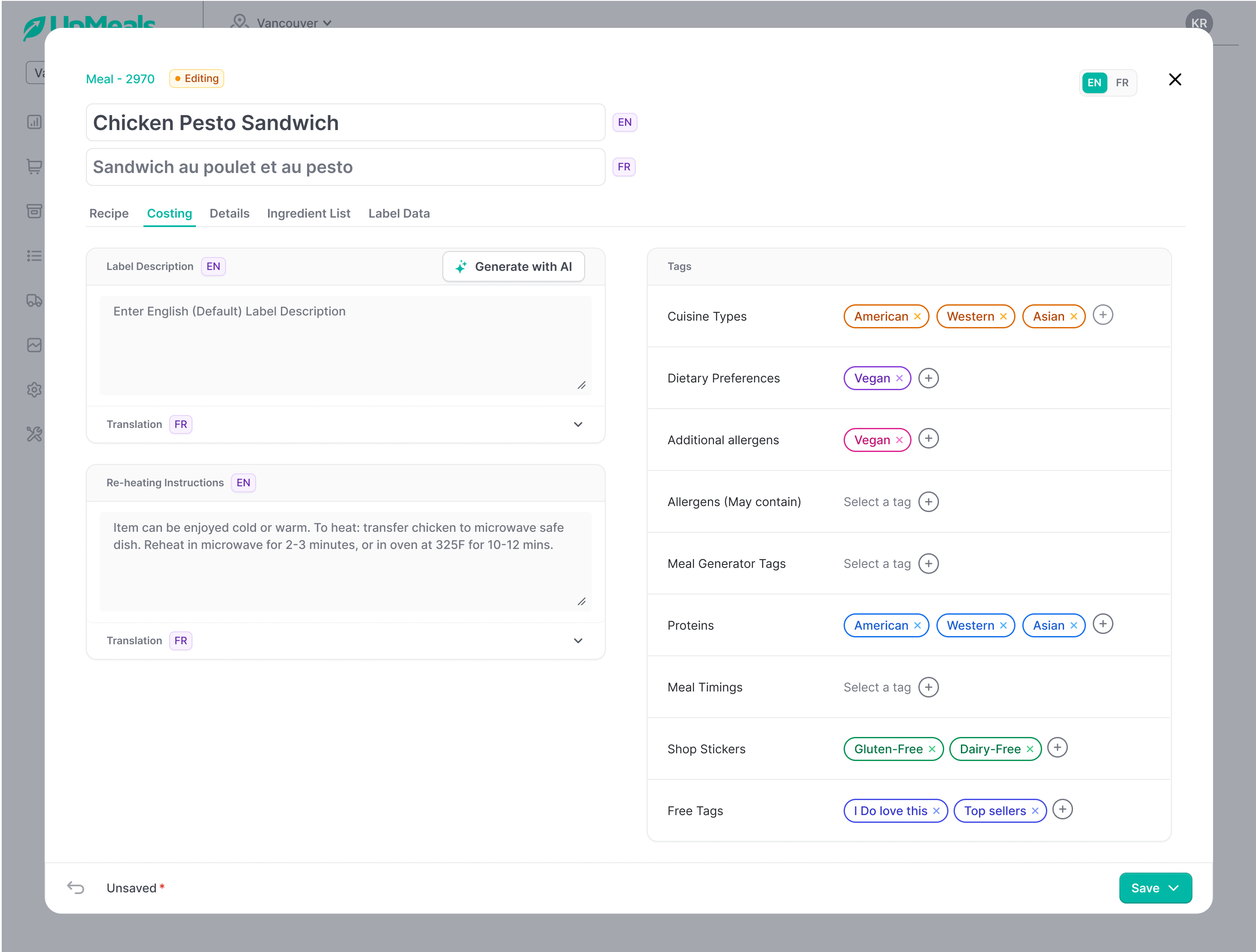
4. Manual friction: Meal scheduling and menu updates were painfully manual, leading to frequent operational errors.
5. No clear system feedback: Admins weren't sure if actions were saved, failed, or processed correctly.
A complete UI/UX overhaul of the UpMeals OS admin system with a focus on:
1. Improved information architecture and navigation
2. Customizable workflows and smart defaults
3. Clear system feedback and confirmation messages 4. Scalable design system built for rapid iteration and engineering handoff
I started by interviewing 12+ stakeholders across operations, nutrition, and kitchen staff. These conversations uncovered pain points ranging from clunky cost workflows to broken navigation in the current system.
In parallel, I ran a heuristic audit and accessibility scan, surfacing 40+ usability issues (keyboard traps, contrast failures, and inconsistent interactions). I also benchmarked against SaaS leaders like ClickUp, Mailchimp, Notion, and Asana to map gaps in enterprise usability.
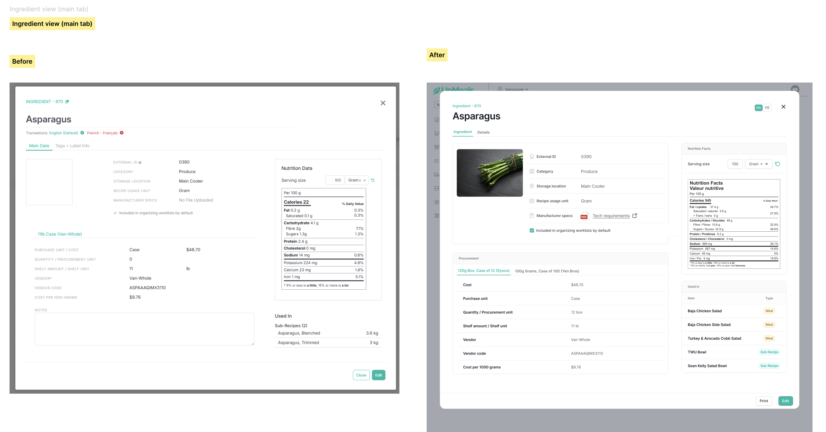
When I joined the project, the platform was overloaded with features scattered across multiple screens—a clear case of cognitive overload.
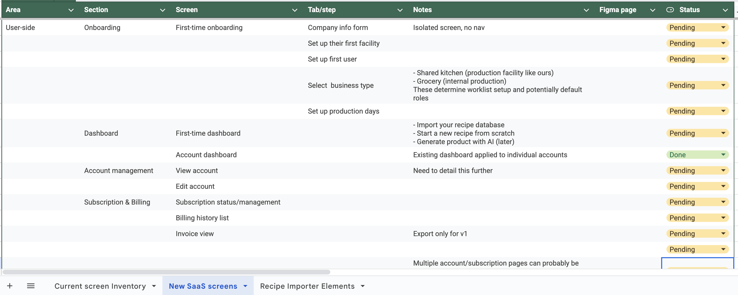
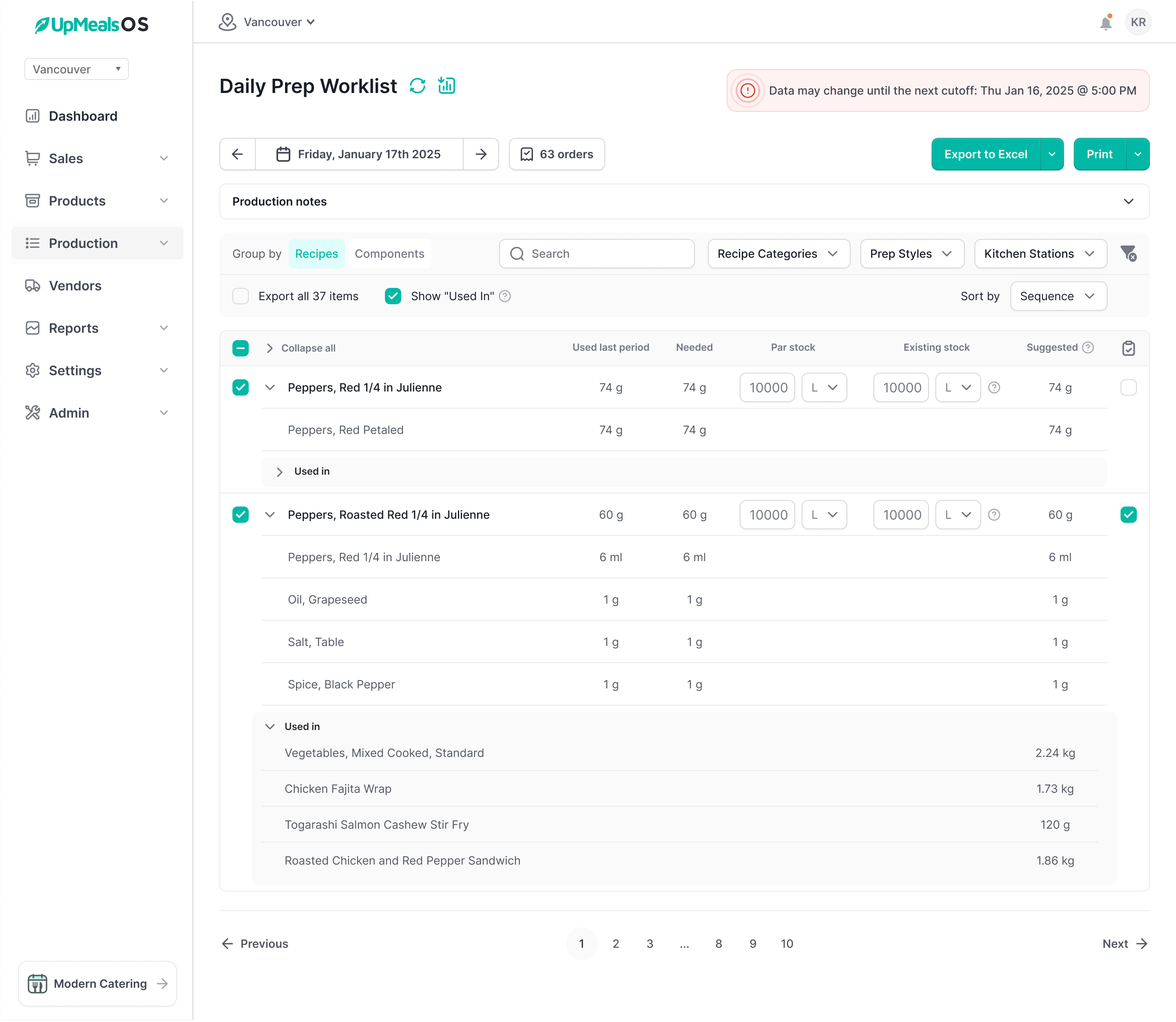
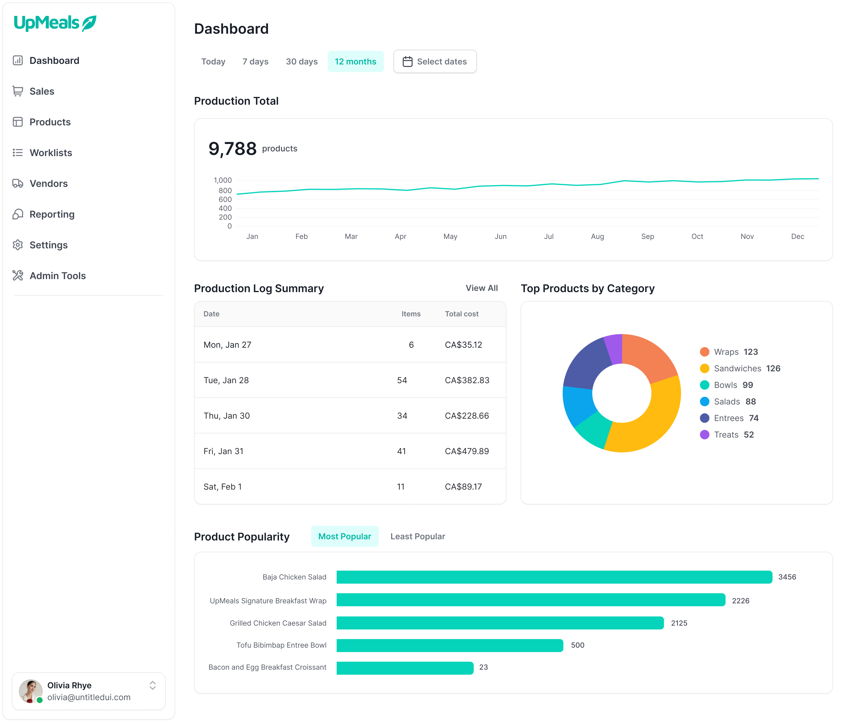
I mapped critical workflows like creating new meals, managing costs, updating production schedules, and handling multi-location operations. Then I restructured the IA into five logical domains: Dashboard, Meals, Orders, Users, and Settings.
To make navigation feel intuitive, I designed role-based dashboards so each persona (kitchen lead, nutritionist, or ops manager) saw only what mattered to them.
To further reduce complexity, I applied progressive disclosure principles (NN/g):
The result was a platform that felt clean, approachable, and scalable—first-time users were no longer overwhelmed, while power users could still access advanced functionality on demand.
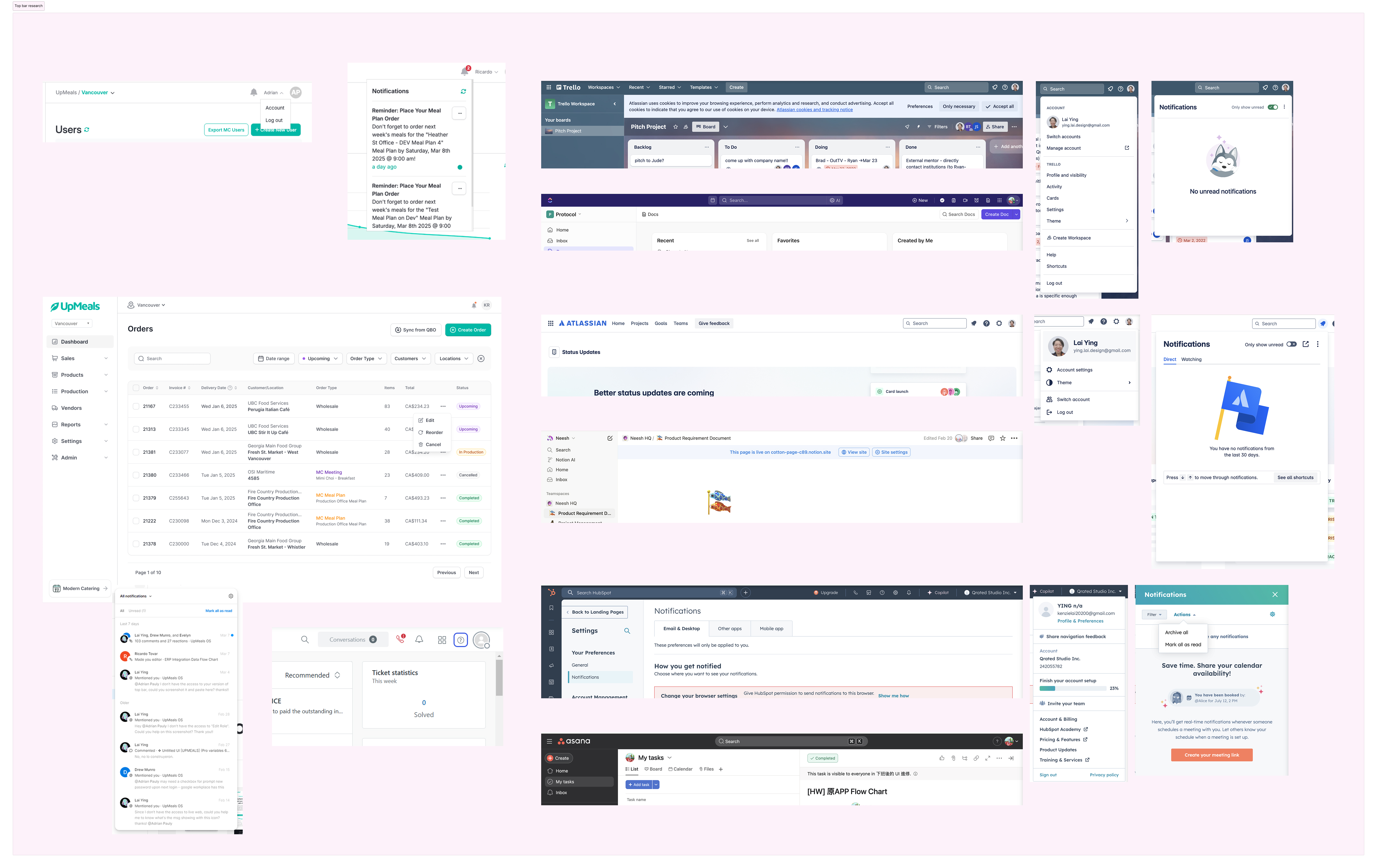
Before locking patterns, I ran quick case studies on micro-interactions—things like table filtering, inline editing, and order management flows. I compared how different SaaS platforms solved them (e.g., Airtable vs. Asana vs. Monday).
By dissecting these approaches, I could cherry-pick the most effective patterns and adapt them to UpMeals OS’s domain. This not only accelerated decision-making but also ensured we were learning from best-in-class tools, not reinventing wheels.
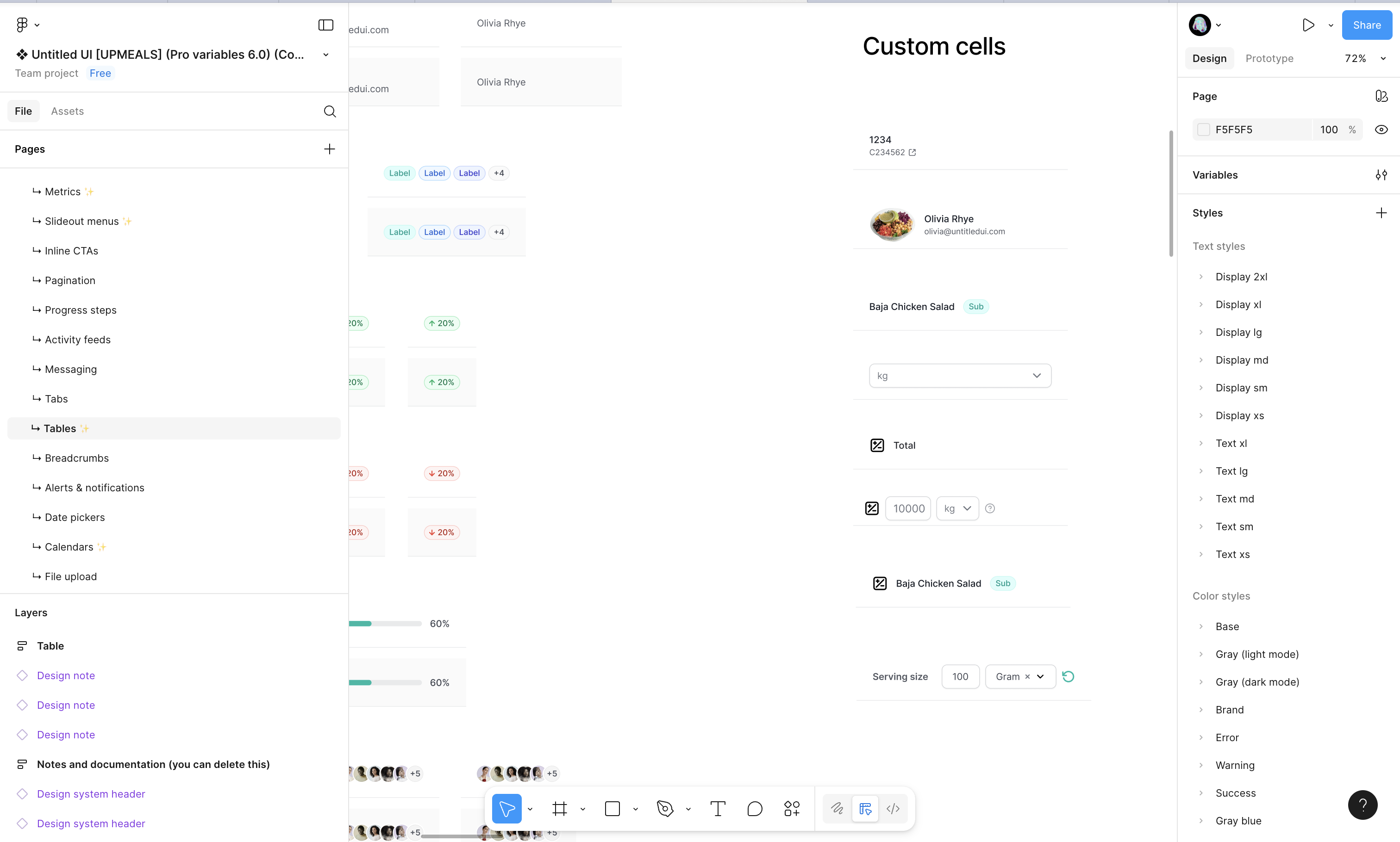
I inherited a partial design system from the previous vendor. Some pieces were salvageable; most weren’t scalable.
I conducted a system audit to rescue usable tokens and patterns while building a new design system from scratch in parallel. The new system introduced:
This hybrid design system balanced speed of adoption with future scalability—a win for both design and engineering.
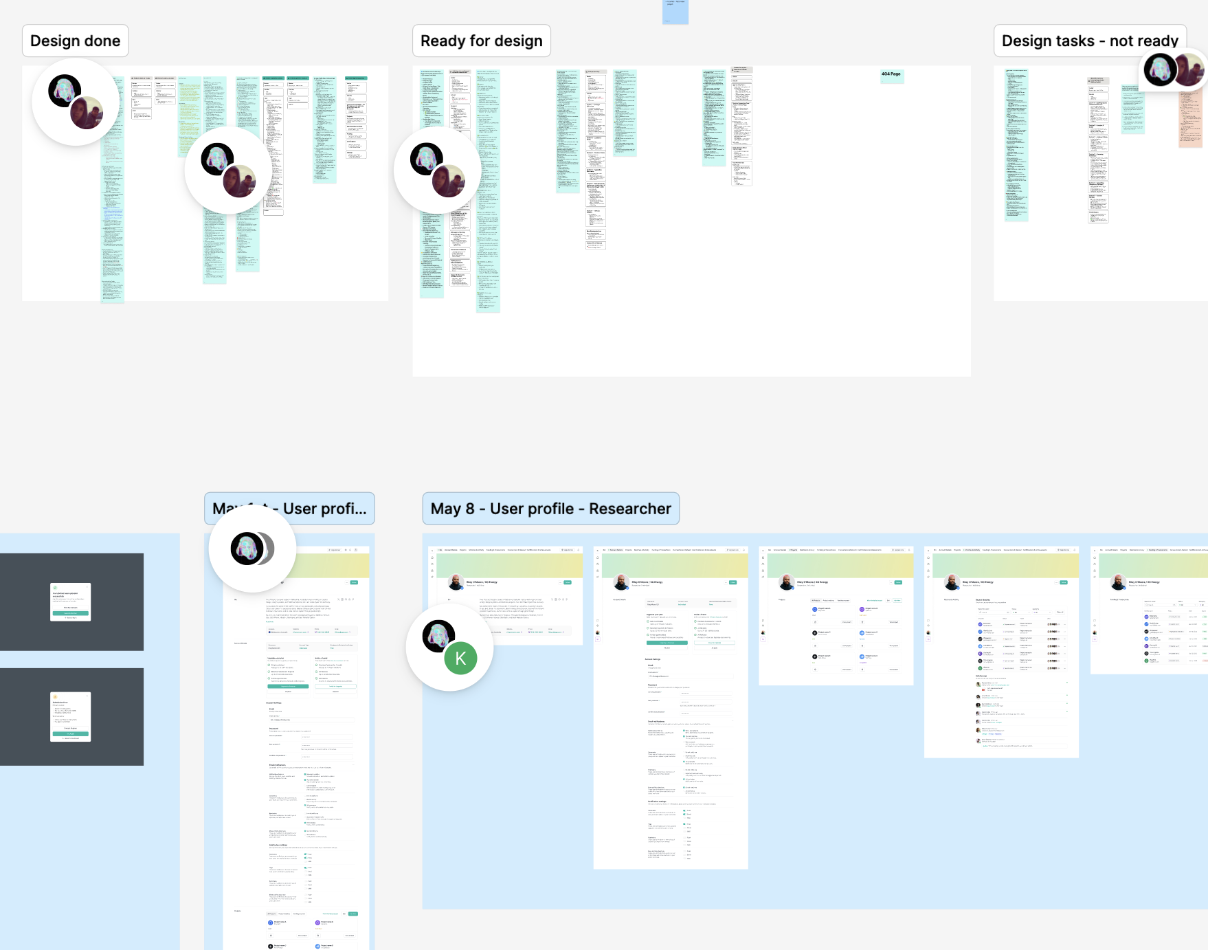
With the first redesign prototype ready, I ran user tests with 10 real UpMeals partners (kitchen staff, nutritionists, and operations managers).
Testing this early not only validated design direction but also built trust with stakeholders who saw their feedback implemented quickly.
To align stakeholders across operations, product, and engineering, I prepared detailed design annotations and comparison decks.
This approach eliminated ambiguity, streamlined decision-making, and gave stakeholders confidence that the redesign was data-driven, not just aesthetic.
The heart of the redesign was taming operational complexity and making it approachable. I simplified through three levers:
The result: workflows were 40% faster, error rates dropped significantly, and users actually described the platform as “less overwhelming.”
I built interactive prototypes in Figma and iterated quickly, layering in:
These refinements were tested in rapid design-test cycles, allowing me to address usability concerns beforehand.
I delivered a hybrid design system in Figma Dev Mode, with tokens mapped into the library and design system for engineering. Weekly QA involved WCAG testing, keyboard navigation checks, and screen reader reviews, ensuring the accessibility standards carried into production.